
Triton
Retired Admin-
Content count
524 -
Joined
-
Last visited
Posts posted by Triton
-
-
-
-
Oke doke then :')Server works now.. I upload old script.. Samthing form mod.gsc made error.. I still not figurate what mybe some Shader or samthing.. But tnx for replay..
*Locked*
0 -
Aloha Sir!
Welcome to our homely abode of Raid Gaming
Enjoy your stay :')
0 -
Mikey said this will be sorted, topic doesn't need to be continued, so guess it should be locked
*LOCKED* (When CM does it hehe, also CAPITALISE THE TOPIC TITLE :angryarnold: )
0 -
in Introduction
Hey dude, welcome the forums, have a nice stay
0 -
> 2015
> to watch TV
If you're going to post, make it useful please.
Hundreds of millions of people still watch TV so yeah
But erm, from time to time I watch
Teh Walking Dead
Supergirl :> (Just started watching, quite dank tbh)
CSI: Cyber (Like CSI, but with how criminals use technology to use their advantage)
Game of thrones from time to time :/
0 -
Good luck!
EDIT: Congrats lmao
0 -
happy birthday matey! :>
1 -
-
Dude, you don't sound 14, you sound alot more posher.
Still, it's cool brother. As long as you're mature, you're sweet in my books :3
1 -
An entire cup for people who throw? gg
Where's your sexual face eh caspa? :3
Also, noice @Darmuh, looking good.
EDIT: He sent me a snapchat instead :3
0 -
in Introduction
Aloha Passion
Welcome to the forums, enjoy your stay :')
1 -
Welcome matey
Enjoy your stay, you nice man.
0 -
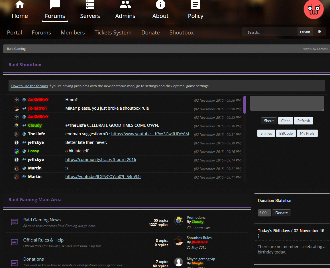
Ahh right, oops sorry :/Should of said you was on about the background and not the text, your sentence made it seem like you was on about the text because both new and old has gray background but newer one has a darker shade of it.
0 -
I'm talking about behind the text, not about the text. I'm so used to seeing her actual users name become bolder that I often don't look at the section title.What are you on about when you mention a darker grey to represent new posts? NONE of the themes on the forums use a darker grey to represent new posts. The new theme makes posts white if they are new and the old theme makes them blue?
Honestly I think you're just finding bad excuses as to why you don't like the old theme because you're too ashamed to admit that you only still use it because you don't like change
Also was there in any need in the last part, it feels to me like you want to criticise someone just become they can't handle certain properties as well as the next person.
0 -
Good luck man, i seriously hope you get it this time, you deserve it
1 -
Quit ruining it JWofles...
979 cartons of milk on the wall, 979 cartons of milk. Take 1 down, pass it around, 978 cartons of milk on the wall.
0 -
Personal dislikes:
1. I don't like the width on the new forums, i much prefer the older slightly wider part of the forums, It just feels far too cramped :/
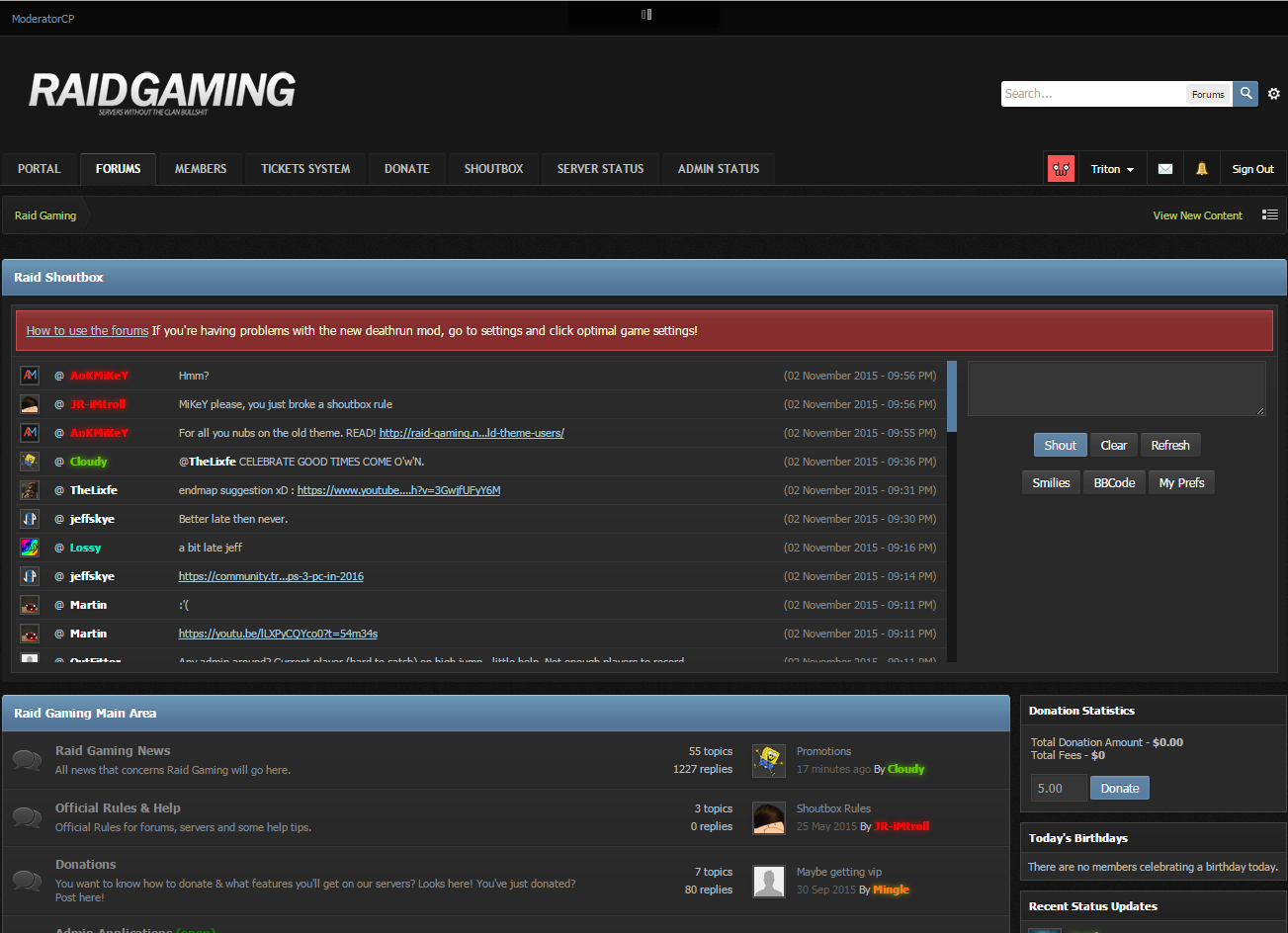
2. I find it hard to see new posts, the darker grey colour to represent a new post doesn't personally feel as nice, i prefer when the user's name is bolder
3. This... Just the bracket hanging off the end feels bad.

4. How on the new theme, lines are missing, which separates each person's shout/thread
5. How chunky sections look (This will probably be fixed if you widen the forums)
6. Really not a fan of the italics, feels to me like it doesn't suit it
7. So many different fonts in one place, please fix the input box's text please :/
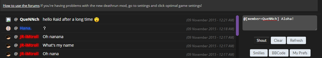
Will update post when i find more
2 -
982 cartons of milk on the wall, 982 cartons of milk. Take 1 down, pass it around, 981 cartons of milk on the wall.
0 -
986 cartons of milk on the wall, 986 cartons of milk. Take 1 down, pass it around, 985 cartons of milk on the wall.
0 -
990 cartons of milk on the wall, 990 cartons of milk. Take 1 down, pass it around, 989 cartons of milk on the wall.
0 -
Looking good man, keep it up! :3
0 -
Good luck matey! :')
1

in Suggestions
Posted · Report post
Alright bruv i'll come